Understanding Price Charts and Candlesticks
Why Charts Matter
A price chart is a visual representation of an instrument's price over time. It's the single most important tool in a trader's toolkit. While you could trade purely off numbers, charts let your brain instantly recognize patterns, trends, and key levels that would be invisible in a spreadsheet.
Types of Charts
Line Charts
The simplest chart type — just a line connecting closing prices over time. Good for seeing the big picture but lacks detail.
Bar Charts (OHLC)
Each bar shows four data points for a time period:
- Open: where the price started
- High: the highest price reached
- Low: the lowest price reached
- Close: where the price ended
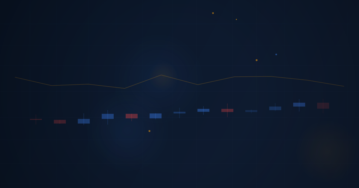
Candlestick Charts (Most Popular)
Candlestick charts display the same OHLC data as bar charts but in a more visual format. Each "candle" has:
- Body: the thick part between the open and close
- Wicks (shadows): thin lines extending above and below the body showing the high and low
- Color: green (or white) means the close was higher than the open — bullish. Red (or black) means the close was lower than the open — bearish.
Reading a Candlestick
Imagine a 1-hour candle for EUR/USD:
- Open: 1.1000 (where price was at the start of the hour)
- High: 1.1025 (highest price during the hour)
- Low: 1.0990 (lowest price during the hour)
- Close: 1.1020 (where price was at the end of the hour)
Since the close (1.1020) is higher than the open (1.1000), this would be a green candle with a body from 1.1000 to 1.1020, an upper wick to 1.1025, and a lower wick to 1.0990.
Timeframes
The same instrument can be viewed on different timeframes:
- 1-minute (M1): Each candle = 1 minute of price action. Very detailed, very noisy.
- 5-minute (M5): Common for day traders and scalpers.
- 15-minute (M15): Good balance of detail and clarity.
- 1-hour (H1): Standard for intraday swing analysis.
- 4-hour (H4): Shows multi-day trends.
- Daily (D1): Each candle = one full trading day. Great for trend identification.
- Weekly (W1): Big-picture view for long-term trends.
Pro tip: Most successful traders use multiple timeframes. They might identify the trend on the daily chart, look for entry zones on the 1-hour chart, and time their entries on the 5-minute chart. This is called top-down analysis.
What Charts Tell You
Charts reveal several important things at a glance:
- Trend direction: Is price generally going up, down, or sideways?
- Momentum: Are the candles getting bigger (stronger moves) or smaller (weakening)?
- Key levels: Where has price repeatedly reversed in the past?
- Volatility: How wide are the candle ranges? Tall candles = high volatility.
Learning to read charts fluently takes practice, but it's a foundational skill you'll use every single trading day. Spend time just watching charts — even before you place a single trade — to develop your visual intuition.
핵심 요점
- Candlestick charts show open, high, low, and close for each time period
- Green/white candles mean price closed higher than it opened; red/black candles mean it closed lower
- Different timeframes show different perspectives — use multiple for context
- Charts are the primary tool traders use to make decisions